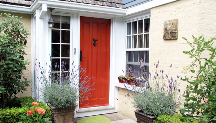
Painting the front door of a property is one of the simplest and least expensive ways to boost its curb appeal. A colorful front door makes the entryway pop—but too much of a good thing can backfire! Here are 8 tried-and-true front door colors that we love, plus a few that you should avoid.
Slate Gray
Let’s start simple! A slate gray, high-gloss door can give an outdated property a fresh and modern look. Fans of minimalist styles will appreciate an all-white façade broken up by a gray door.
Spruce Green
Spruce is a blend of dark green and blue. It’s a cool-toned color that looks great against cedar shingles and complements Craftsman-style homes. White trim is the best bet when choosing this front door color.
Bright Yellow
Proceed with caution when choosing yellow for the front door color! Some yellows come across as cheerful, but other shades look sallow or garish. The trick is to pick something like daffodil or butter yellow, and steer clear of anything that reminds you of a piece of construction equipment!
Lavender Blue
Lavender is the new in-color, which means that it will likely appeal to younger buyers. Try updating a home with historic features by painting the front door this color. However, test a few swatches to make sure the shade isn’t too purple.
Sage Green
If spruce is too dark for the property, go up a few shades to sage green instead. Sage is a lighter green with touches of yellow that looks amazing against brick or stone.
Bright Red
This dramatic red hue is a great choice for a Colonial-style home. Although it’s bold and eye-catching, bright red is a traditional front door color. It’s especially impactful on a property with white siding.
Navy Blue
Navy blue is more understated than most of the front door colors on this list, but it can still make a big impact. Navy works with almost any style of home, from cottage to Craftsman to townhouse.
Teal
The trick with teal is finding the right shade for the property. This is another color that will require some swatching in a variety of lights to get it right. Lighter teal lends a beachy vibe, while a darker teal is more of a Boho color.
Colors to Avoid
Let’s take a minute to talk about front door colors to avoid. While the new owners can paint the property whatever shade strikes their fancy, it’s best to avoid anything too bright or overly trendy when listing the house on the market.
Avoid bright orange, green, and blue—basically, anything that looks like a kindergartener’s finger-painting. Millennial pink is played out, while aqua and coral are both overused as front door colors. If the seller can’t settle on a fresh color for the door, you can’t go wrong with high-gloss black or white!


